The Challenge
Our mobile banking app had grown to 250+ features, and customers could not find what they needed. New users called it complicated; affluent users said it was pretty but dumb. Each squad shipped its own patterns, so navigation felt random. Competitors like Sber and Tinkoff offered cleaner flows.
We sat 8th in the Markswebb Mobile Banking Rank. I had to fix navigation, keep teams aligned, and launch a new credit-card flow inside the app.
Approach
Cognitive-load audit
Ran tests and produced a cognitive heat-map of the old app (see diagram) with UX researchers. Home and "Payments & Transfers" lit up in deep red, showing the heaviest mental load; niche screens clustered lower. This told us where to simplify first.
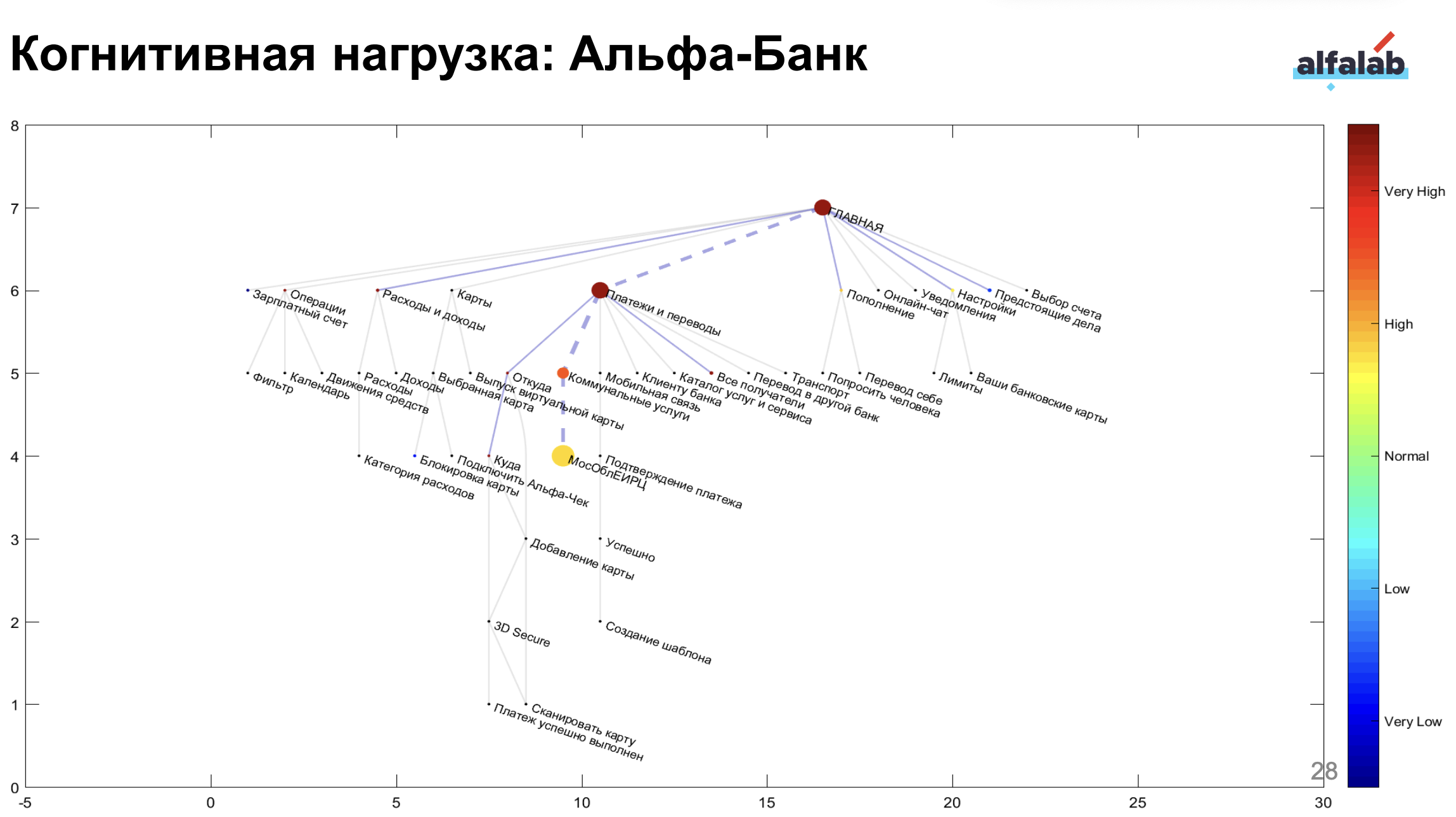
Cognitive load heat-map of the old app
Persona journey research
Interviewed customers with UX researchers and mapped three archetypes: Impulsive Spender ("Транжира Противоречивый"), Careful Saver ("Бережливый"), Opportunistic Explorer ("Оппортунист").
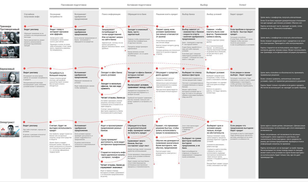
User personas that guided our redesign decisions
Design sprints
Ran focused three-day sprints with designers, PMs, engineers, and business stakeholders to frame problems, sketch solutions, prototype, and test—all in the same week. This built shared ownership and sped up decision-making.
Bottom-tab concept
We chose a 4-tab structure—Home / Payments / History / Chat—that covered 90% of daily tasks. Built quick Figma prototypes and clickable Android proofs for UX test → got positive feedback.
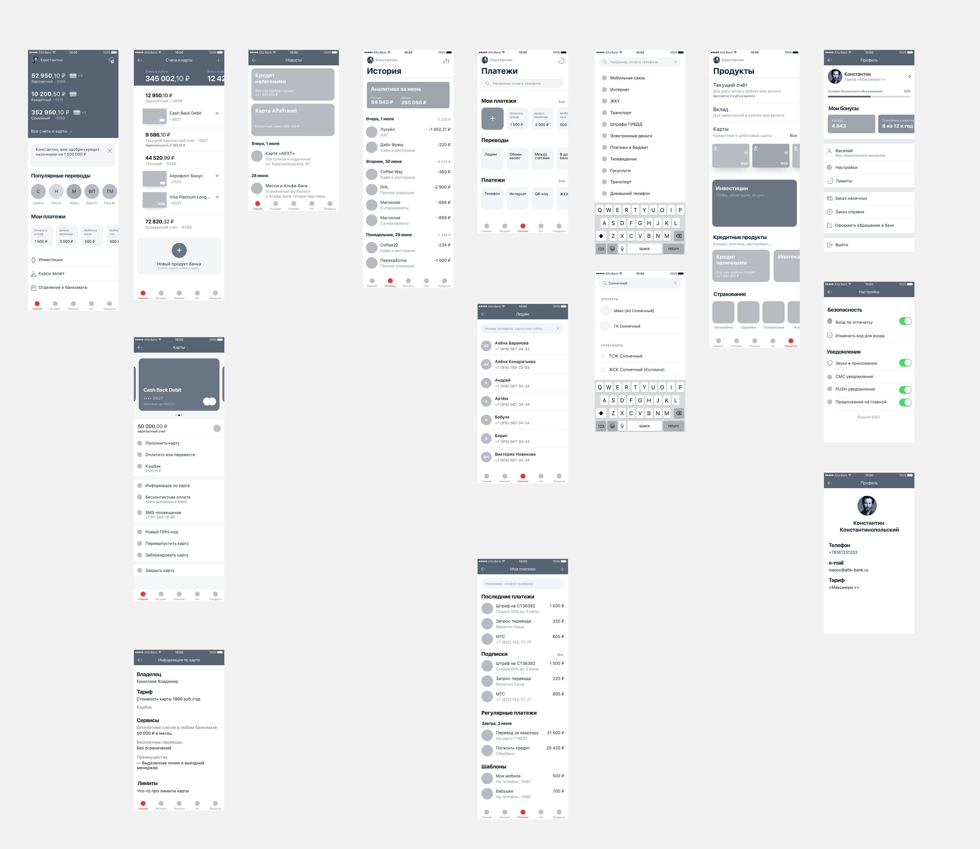
Prototypes
Balanced squad backlogs
Split the redesign epics into bite-sized user stories and spread them evenly across six squads. Each team parked the stories inside its own sprint backlog (functionalities familiar to teams), so they could ship new features and navigation fixes in parallel.
Results
All six squads adopted the shared rules, ending duplicate sections and ad-hoc menus. Took 6 months, plus A/B test and auto-testing (1 month).
Markswebb rank: 8 → 1 (Mobile Banking Rank 2019, iPhone).
Key Learnings
- Cognitive-load mapping pinpoints where design effort matters most.
- Bottom tabs are familiar; they lowered load without a full redesign inside of the pages. A new app turned into an evolution, not revolution.
- Fast research + prototypes save money—cheaper than fixing a bad launch.
- Design sprints and balanced backlogs motivate and involve whole organisation – make multi-scrum teams working together naturally.